5 common myths about graphic design
Graphic design has evolved over the years. But while it’s a constantly changing art form, there are common graphic design myths that many designers and non-designers still believe to this day. Below, we list 5 of these myths and give you inspirational design tips along the way.
The phrase was first used by illustrator and book designer William Dwiggins to describe his work in printed media such as book designs, illustrations, typography, lettering, and calligraphy. By the 1950s, the term was widely used to describe the creation of visual materials like posters, print advertisements, and street signage.
But as technology has changed, so too has the use of graphic design. Now, its use cases go far beyond just printed materials, spanning across the digital and even virtual reality world. With so many iterations of graphic design over the years, it is no surprise that there are some major misconceptions as to what the term actually means. In this article, we help set the record straight by clearing up 5 of the most common myths about graphic design.
1. Graphic design is just about producing logos
Logos are an important graphic design asset for any business. They become an emblem of your company, which people will come to identify with your brand value and what you offer. You only need to look at the Firefox swirling fox on a globe or Walt Disney´s arch over castle to see this in action.
“Design is thinking made visual.”
– Saul Bass, designer & filmmaker
This can be applied to a vast array of mediums whether that is posters, magazine spreads, album covers, infographics brand presentations, menus, websites, social media, and the list goes on!
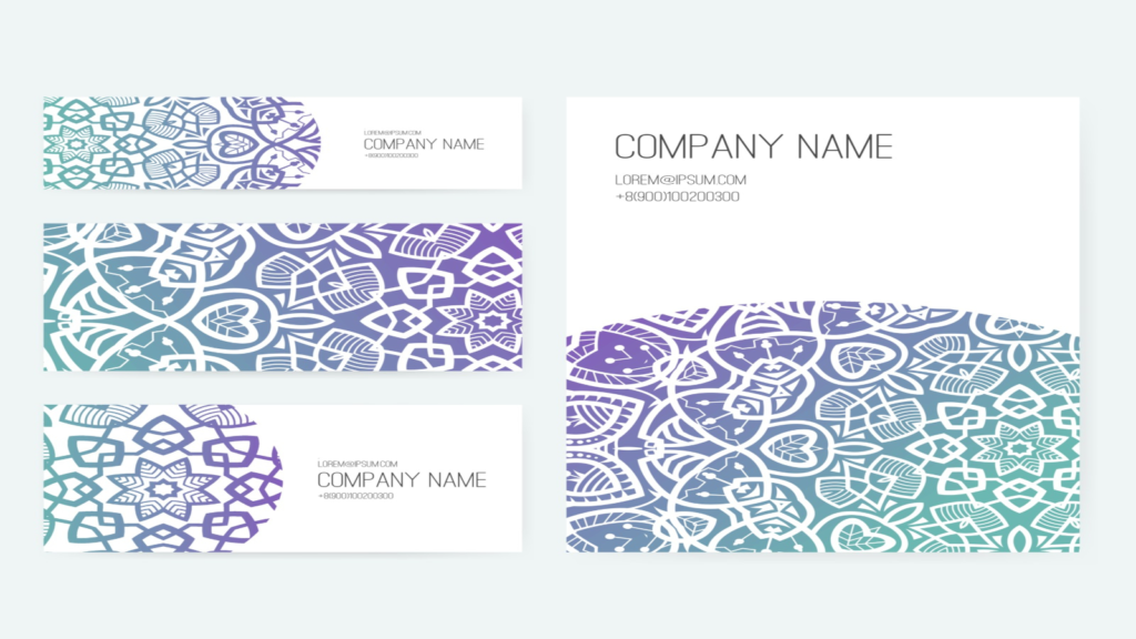
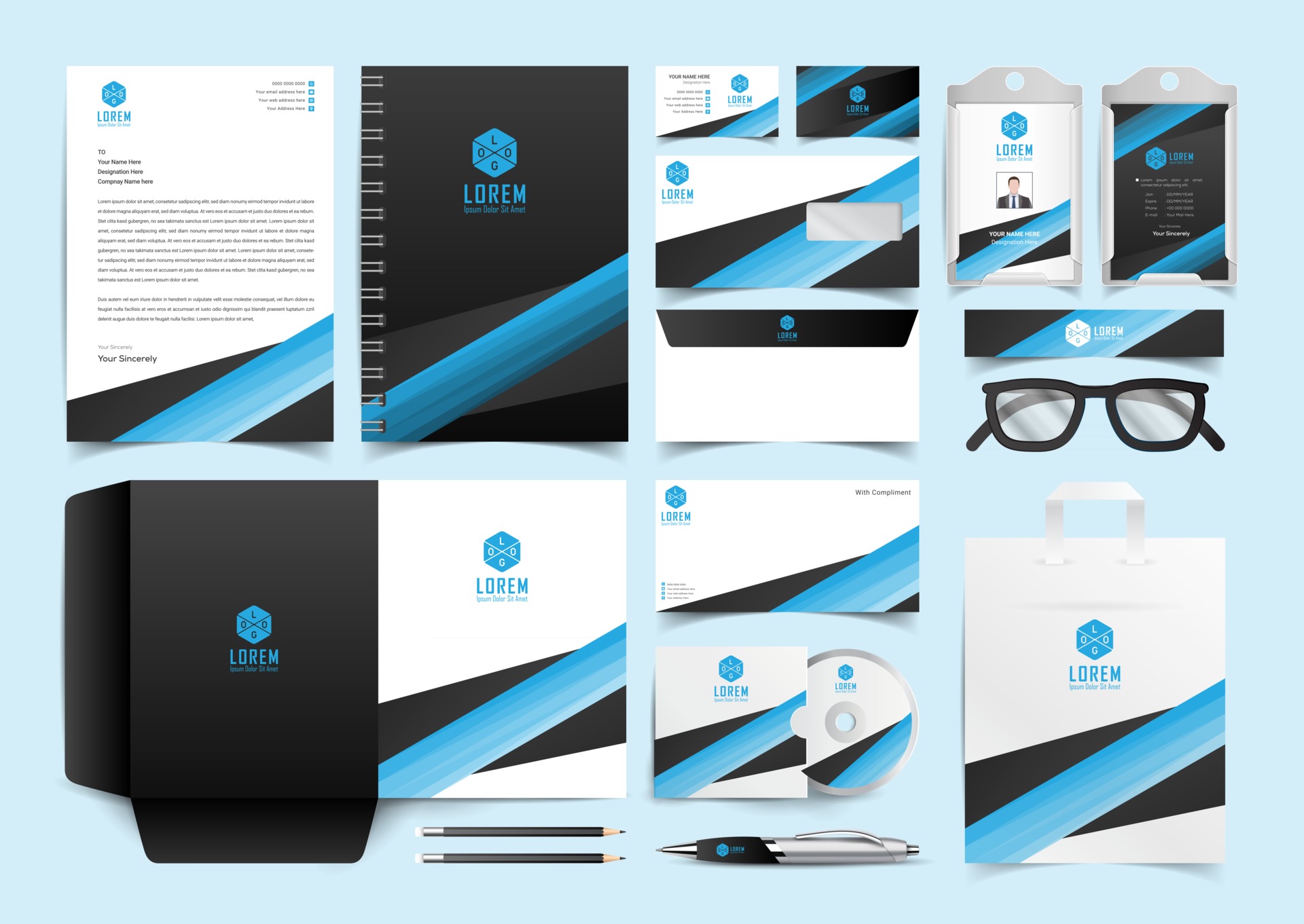
#Design tip: Use your logo as a starting point to build out the rest of your brand kit, including your color palette and typography. These should remain consistent throughout all of your brand assets for a cohesive look.
2. You need fancy tools for graphic design

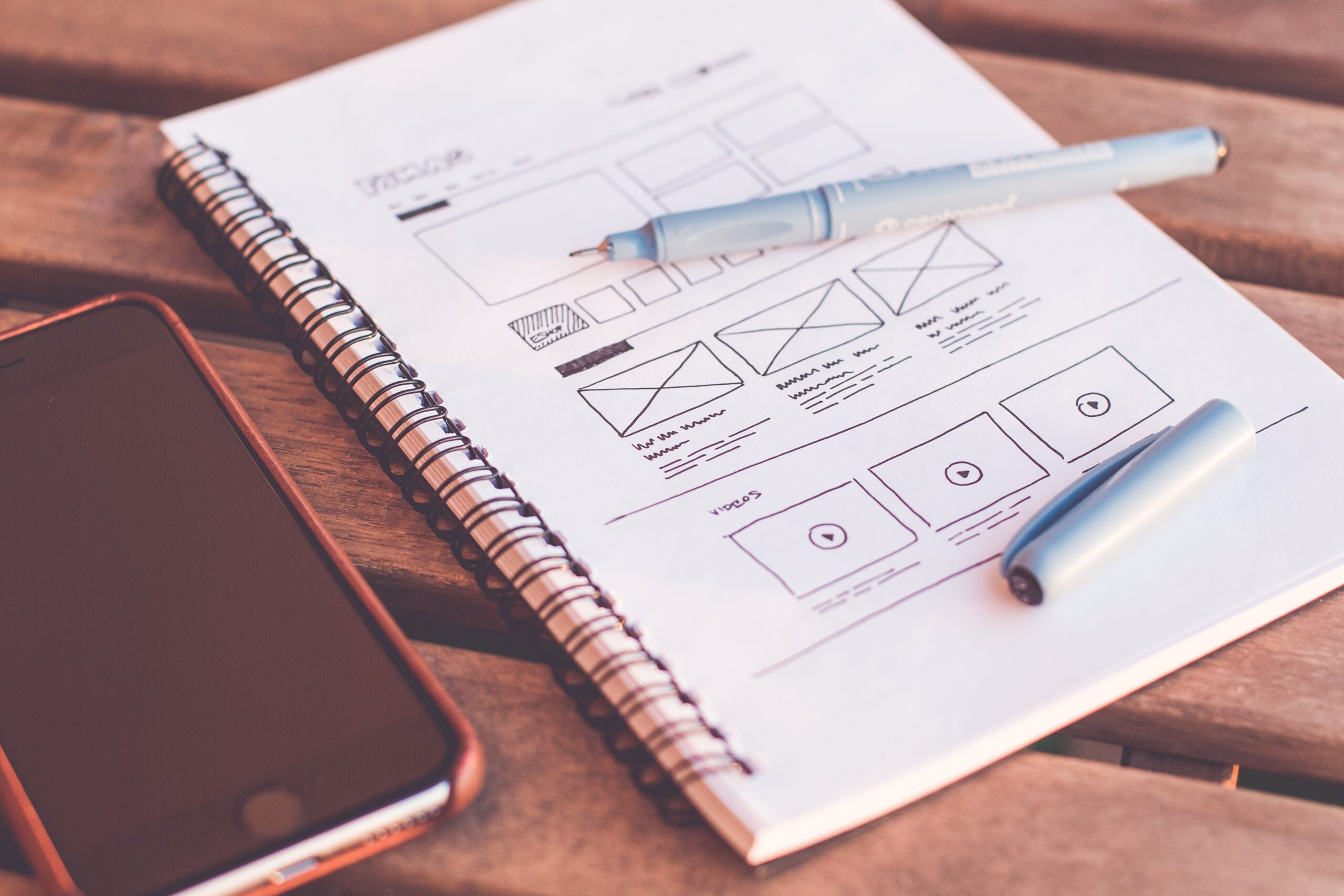
By Tranmautritam from Pexels
Most professional graphic designers think they need to use complex design software and a tablet with a stylus for freehand design elements. While these resources can give designers more freedom with their designs, they can be quite expensive and take years to master. The good news is, the average person doesn’t need to invest in these pricey tools to create graphic design elements.
You have cheaper software to choose from today and it is still professional and very capable of doing the same thing as Photoshop and that is Affinity Photo. You also have a whole bunch of online services that produce professional results such as, Canva or Placeit.
#Design tip: There are many free design tools on the market such as Canva that makes graphic design easy and accessible. Using these tools for every piece of branding collateral will help give your brand have an elevated and professional look.
3. Graphic design is only for printed mediums

In 2021, graphic design encompasses a wide range of digital mediums, perhaps even more so than print. This includes website banners, social media graphics, motion graphics, ads and email newsletters. Many graphic designers even find that their roles now also includes web and UX (user experience design), content creation and social media. The latest trends that graphic designers has to master is motion graphics and fluid design due to ever increasing mobile use.
#Design tip: Whether you make YouTube channel art, email headers, Facebook covers or blog banners, each web or social media platform uses banners of different sizes. Using templates in the right dimensions is of utter importans to ensure that your design will fit perfectly and avoid pixelated banners.
4. In graphic design it is crusial to follow trends

As with any creative industry, trends rapidly come and go in the graphic design world. In 2021 it is all about 3D grahics, vivid colors, 3D Typography Design, Monochrome and Duotone Designs. It’s more than likely that 2022 will bring with it a hole new bunch of visual trends.
Trends can be fun to incorporate into your designs, but they should not be your main focus. Designs that incorporate fleeting trends can easily look dated a few months down the road, meaning they will no longer have a powerful impact on their audience.
Editorial Staff
#Design tip: For graphic design materials that will only be used for a certain amount of time (for example, social media graphics or ads) it’s fine to play with new trends. However, for materials that will be used indefinitely, like your brand logo, it is a good idea to stick to timeless design elements.
5. Graphic design is about creating 100% original designs every time

Originality is important when it comes to graphic design. it will allow you to set your brand apart from competitors. However, this does not mean you have to create 100% original designs from scratch every time you want to make visual materials. Even professional graphic designers set up templates, for when they are going to be creating similar assets on an ongoing basis. This allows them to achieve consistency across their brand materials.
#Design tip: Setting up templates for all your graphics is a great way to save time. You can set up one or a few templates with brand colors and logo for each client, which you can simply customize with text each time you want to make a new graphical item.
Hope this post have give you some ideas about graphic design and that it is not rocket science to become one. Good luck!


